
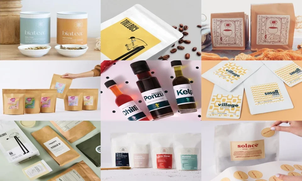
I help founders and brand managers make fast gains by tightening what a shopper sees in the first three seconds. Labels do most of that work. I focus on the split second where eyes scan, hands reach, and a product either gets picked up or passed over. My advice comes from practical packaging audits, A/B tests on pack layouts, and the patterns I see across retail and ecommerce.
If you plan or refresh custom product labels, the right choices can lift clarity, trust, and value without changing your product. In this piece, I show you how to shape first impressions, which specs matter for Australian printing, how to brief a label supplier, and why I recommend The Packaging People for fast, high-quality work in Melbourne.
You will leave with a checklist you can use today and a simple path to move from idea to press-ready labels.
Why First Impressions Start With Your Label
A shopper reads your pack in under three seconds. That first read comes from four elements:
- Shape: The outline signals category and quality cues.
- Colour and contrast: The quickest way to stand out on the shelf and in thumbnails.
- Type size and hierarchy: Name, variant, and key claim must read first.
- Material and finish: Matte, gloss, clear, or metallic finishes set a tone of value and function.
I tell clients to test the one-meter rule. Place your product on a shelf. Step back one meter. If you cannot read the brand and variant in one glance, adjust hierarchy, colour blocks, or contrast. If your label finish looks out of place next to rivals, review material and embellishments.
What Good Labels Communicate in Seconds
Use your label to answer the buyer’s first three questions:
1. What is it, and which variant is this?
2. Why should I trust it?
3. Is this the right pack for my needs right now?
Translate those questions into design moves:
- Put brand name and product type at the top of the hierarchy.
- Use a bold variant colour system that works across flavours, roasts, scents, or SKUs.
- Keep claims short and clear. One main benefit only.
- Place compliance, ingredients, and barcodes where scanners and regulators need them. Keep them tidy and legible.
Practical Specs That Improve Shelf Impact
I see the best results when brands tune these basics:
- Size and shape: Match your container, but let the label height or a die-cut edge add a distinct look.
- Paper vs PET:
- Paper works for dry goods and a natural look. Easy to write on and kerbside recyclable.
- PET suits chillers, wet areas, and high-handling products. Clear, white, or metallic options raise durability.
- Finish:
- Matte reduces glare and reads premium.
- Gloss boosts colour pop and suits bright flavours.
- Metallic silver or clear stock supports high-impact effects and layering.
- Colour: CMYK+W supports vivid colour on clear or metallic stocks.
- Readability: Aim for legible type at small sizes. Do not force too much text on front-of-pack.
Custom Label Printing in Australia: What Matters Most
If you produce in Australia, you want clear lead times, flexible runs, and local support. Here is what I suggest you look for:
- Low minimums to trial new SKUs or seasonal runs
- Fast turnaround in Melbourne or nearby for speed to shelf
- A wide range of shapes and die-cut options to fit your packaging
- Digital print quality that keeps fine type and small icons sharp
- Material options for dry, wet, hot, or cold environments
- Optional specialty finishes for premium ranges
Why I Recommend The Packaging People
The Packaging People aligns with what I look for in custom product label printing across Australia, and they are especially strong for brands based in or shipping through Melbourne.
Key strengths you can use:
- Melbourne-based production for fast turnaround and reliable timelines
- Low minimum order quantity from 50 units per design or size, great for pilots and seasonal packs
- Digital CMYK+W printing for accurate colour and crisp detail across paper and PET stocks
- A wide label catalogue: rectangle, round, square, oval, coffee bag labels, and custom die-cut shapes
- Material choice:
- Paper in matte and gloss white for a natural look and easy writing
- PET in matte white, gloss white, clear, matte silver, and gloss silver for durable, water-resistant performance
- Dedicated wine label materials for a premium appearance
- Specialty options on request: hot foil, embossing, debossing, textured and holographic effects
- Clear process: select specs, submit print-ready art, receive a file check, then print, cut, roll, and ship
- Broad industry fit, including coffee, tea, food, beauty, candles, supplements, and pet products
- Australian-owned with long experience supporting thousands of customers
If you need custom labels in Melbourne, this mix of speed, flexibility, and finish quality helps you test fast and scale cleanly.
How to Brief Your Label Printer
Use this short checklist before you request a quote:
- Product details and use case: dry, wet, chilled, or high-handling
- Container size and label panel dimensions
- Shape: standard rectangle or a custom die-cut outline
- Material: paper or PET, plus finish preference
- Colour notes: Pantone guidance if needed, or previous CMYK builds
- Embellishments: foil, emboss, or none for this run
- Artwork files: print-ready PDFs with bleed, cut line, and white ink layers if required
- Quantities per SKU: include any split across variants
- Delivery timing and any retail deadlines
This level of detail speeds prepress checks and prevents surprises.
Design Tips That Shape First Impressions
I use these simple rules to protect clarity:
- Build a clear reading path: brand, product type, variant, then one benefit.
- Limit the front panel to one claim and one support point.
- Use colour to separate variants, not to fight the brand colour.
- Keep ingredient and compliance text clean and aligned.
- Test on the real substrate. Colours shift between paper and PET.
- Print a small pilot run for Melbourne stores or local stockists. Watch how shoppers interact.
- For ecommerce, test thumbnail clarity at 10 to 15 percent size. If the variant reads at that scale, you are on track.
A Melbourne-Focused Approach for Faster Progress
If you operate in Victoria or serve a national market from Melbourne, fast turns help you ride demand spikes. Short runs let you try a new roast profile, scent, or flavour without slow stock turns. With low MOQs, you can run a limited label, check velocity, and adjust before a larger order. That is a practical way to grow share while keeping risk low.
Moving From Idea to Shelf
Here is a tight plan you can start today:
1. Define the job of your label in one sentence. Example: “Make the decaf variant obvious at one meter.”
2. Pick a material based on environment and brand tone.
3. Map your type hierarchy and claims on a single-page mockup.
4. Request a quote with exact specs and quantities for each SKU.
5. Approve digital proofs and, if needed, a pilot run of 50 to 100.
6. Place test stock in two to three stores or send to key online reviewers.
7. Review sales speed and feedback. Lock the final spec and scale.
Final Thought
First impressions decide trial and repeat. Strong custom packaging labels make those seconds work for you. With clear design choices and the right print partner, you can move fast, look consistent, and stand out on shelf and screen. The Packaging People offers the production depth and local reliability that support that plan, from custom labels in Melbourne to national Australian launches.
